An end to end mobile experience for both managers and employees to manage their shifts, hours, and communication.
Planday
UX Design, 2018
Role
Lead Designer
Year
2016-2018
Skills
- User Research
- Information Architecture
- UX Design
About
Planday is a scheduling app used primarily with gig and part time workers in the retail and hospitality industries. I came onboard at the start up in 2015 to help them increase their mobile app presence. I lead the design and launch of the Android app and later took ownership of mobile across all platforms. Planday is extensive and of course our customers wanted all the functionality of web on mobile. Much of the challenge was working with the PM and business to plan roadmaps and MVP’s to get the basic functionality out to customers as soon as possible. Here, are some of the core features.
05 BRanding
Typography and Colors
We kept the branding simple and used native fonts as well as custom greys. Secondary colors are used for icons and other UI elements, while all call to actions and primary buttons are the Planday blue.
San Francisco
A B C D E F G H I J K L M N O P Q R S T U V W X Y Z
a b c d e f g h i j k l m n o p q r s t u v w x y z
Roboto
A B C D E F G H I J K L M N O P Q R S T U V W X Y Z
a b c d e f g h i j k l m n o p q r s t u v w x y z
#199BD7
#0DC05F
#D9425A
#FAB201
#22C3C2
#38444F
#6C7175
#939BA3
#DFE7EE
#F5F7FA
The App
01 Overview
A summary of your day
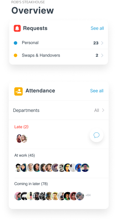
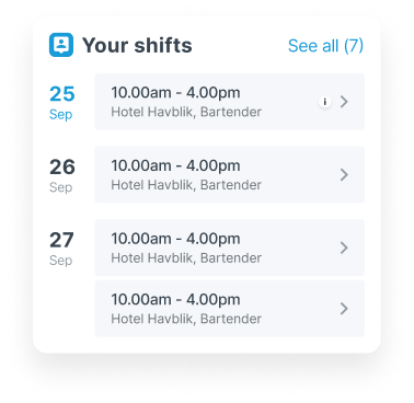
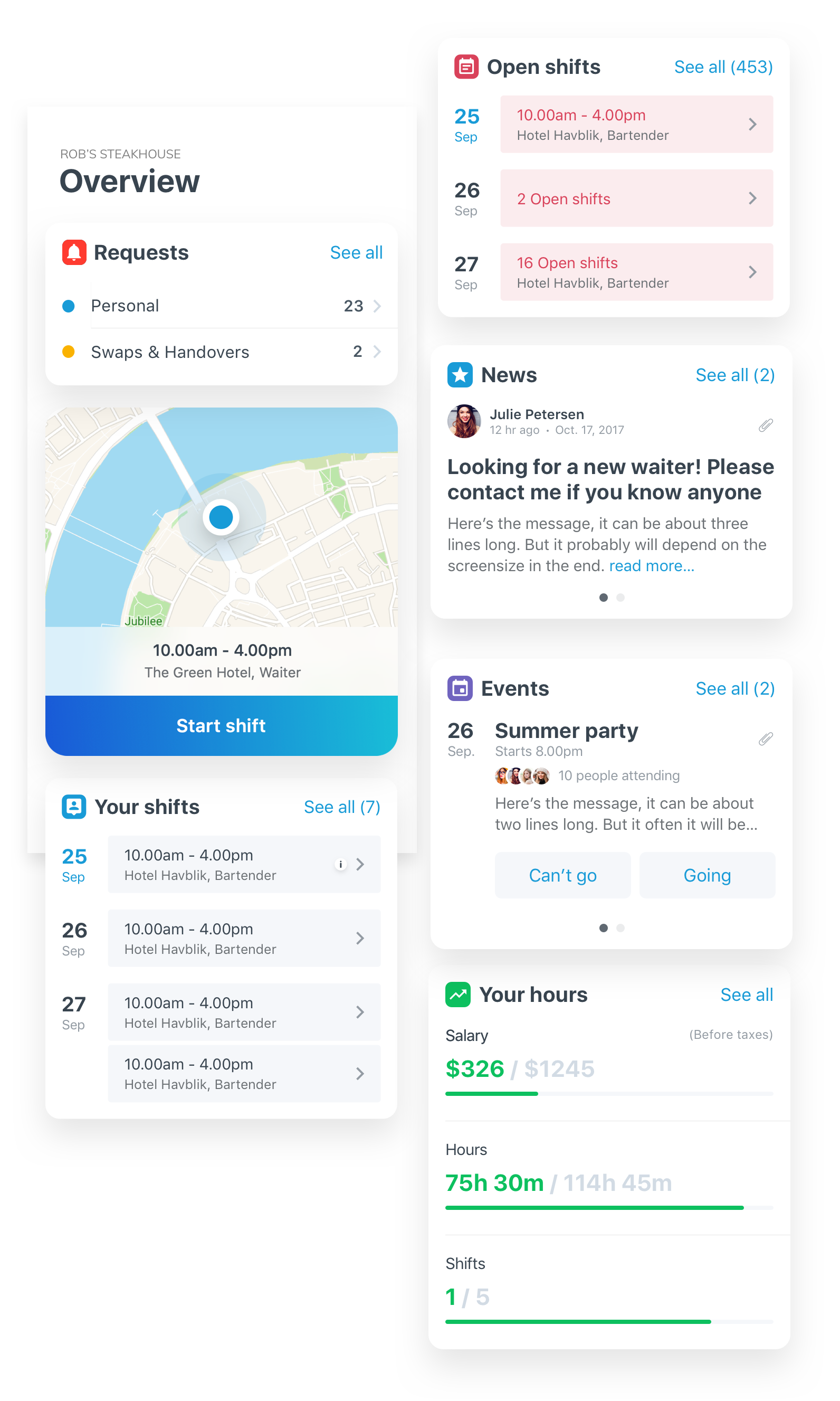
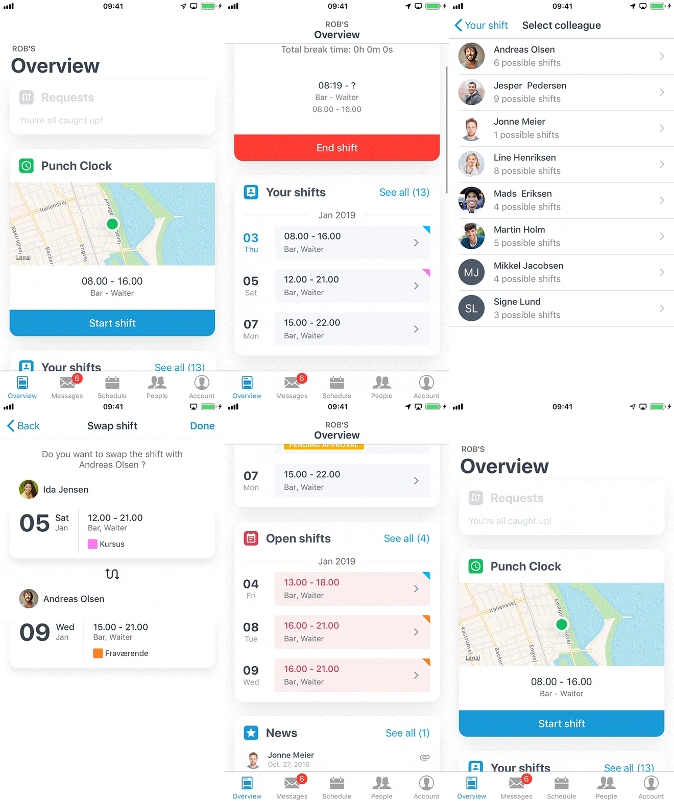
The Overview is the landing page of the app. Here you’ll find everything that may need your attention or is pertinent to your given work week. You’ll get a notification if anyone has requested a shift from you, you can punch in and out of your shifts, see the next five shifts coming up on your schedule, the next five open shifts you’re eligible to book, as well as news and events. Most of our non-managerial users spend 90% of their time here.
02 Shifts
Punch in, swap, and request
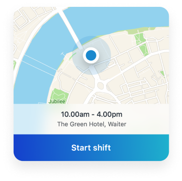
The punch clock option allows users to clock in to their shifts either by GPS’ing their workplace or detecting if they are on the workplace wifi. You can quickly punch in and out of shifts and breaks right from the overview. “Your Shifts” is a summary of your entire schedule by month as well as past shifts. Within each shift detail you can further swap, handover, or sell your shift. And “Open Shifts” are all shifts eligible for booking. See them similarly by month. All shift requests must be approved by your manager, so we display the state of your request and allow you to cancel it at any time.
03 Messages
Keep in touch
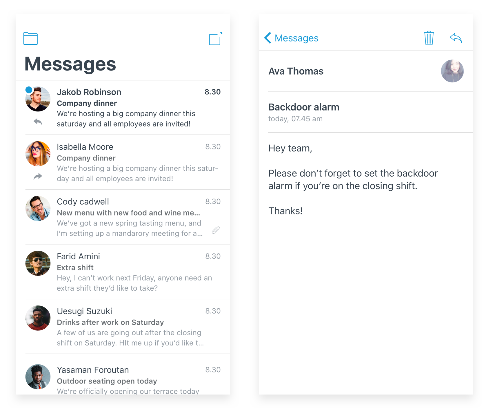
Our messages section allows coworkers and managers to communicate with each other, within the app, without having to share out personal information. You can send to entire groups or individual employees. You will also get notifications from the system if you have a shift request that was approved or any documents you need to sign.
04 Schedule
Schedule on the go
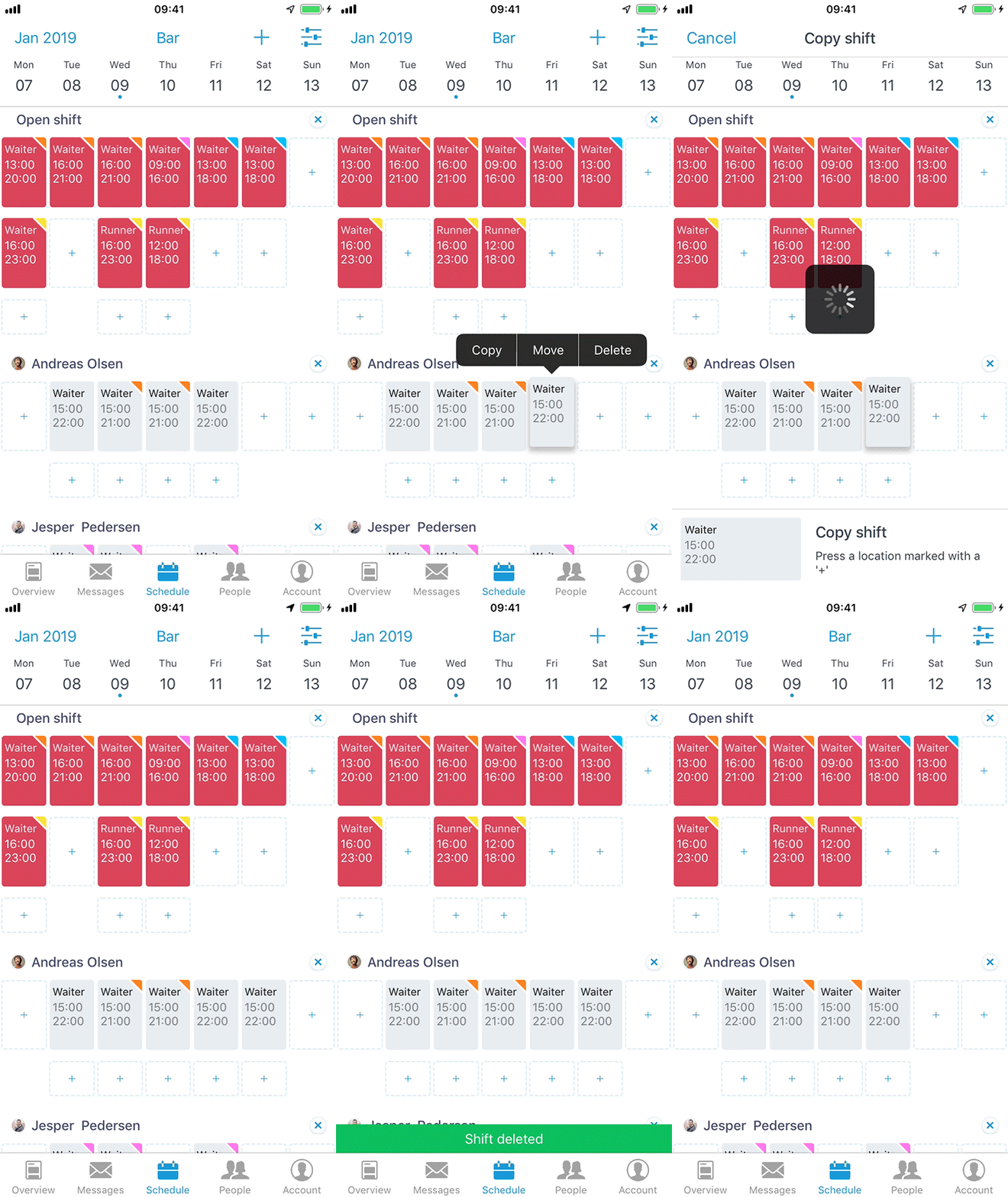
The schedule feature is the heart of the app, mostly for managers. While most scheduling is done on web, small business owners who did not have a dedicated scheduling manager needed to be able to edit or enter shift data on the go so we wanted to make it as fast and easy as possible. A long press on any shift will allow you to copy, paste, and move shifts freely, removing the need to manually add each and every shift.
05 Schedule
Templates
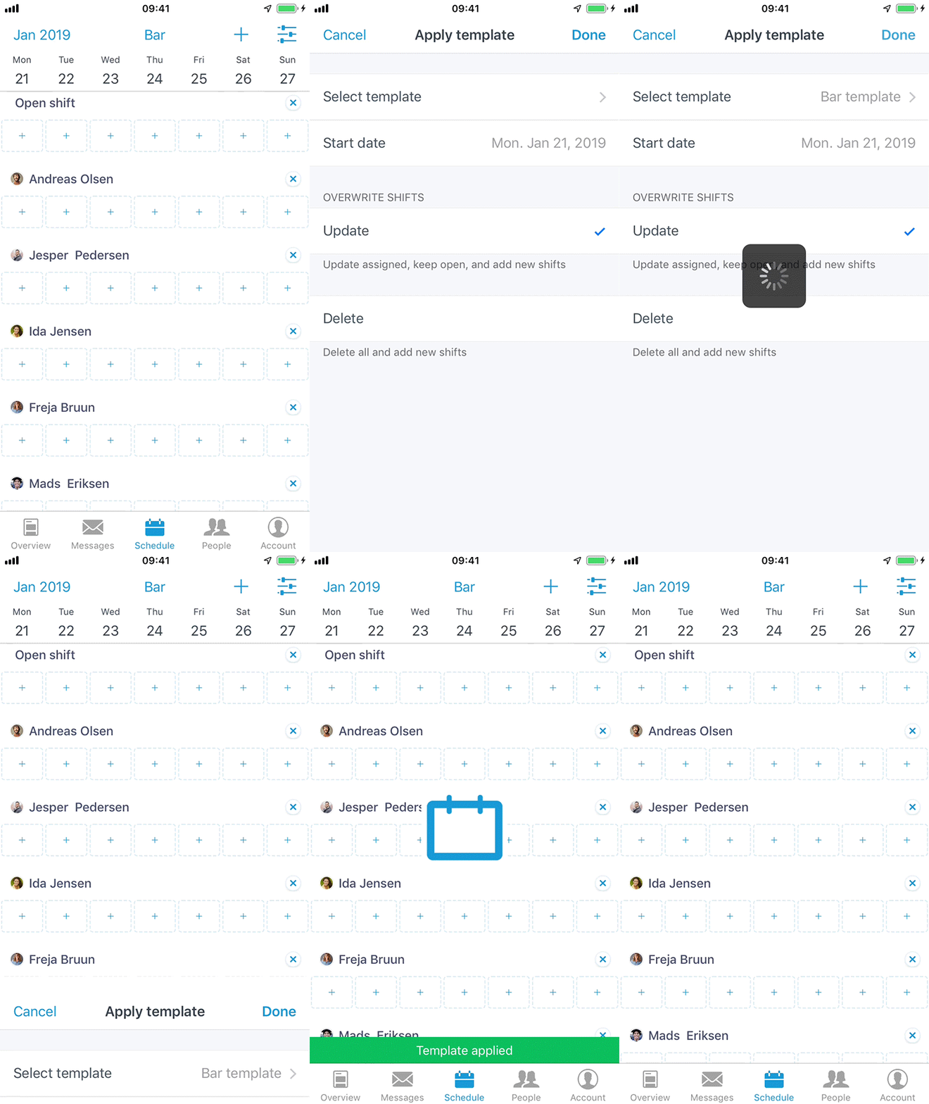
Almost all of our scheduling managers requested this feature. Most schedules were pretty much the same week to week or month to month, so we created templates. Save out any given weeks of your schedule and then apply it to one or several weeks in the future. We allow you to delete any pre-existing shifts or simply have them overlap your template. We also keep track of working time rules and will alert you if any shifts are in conflict or go over your region’s maximum weekly work hours.
06 People
Manage your crew
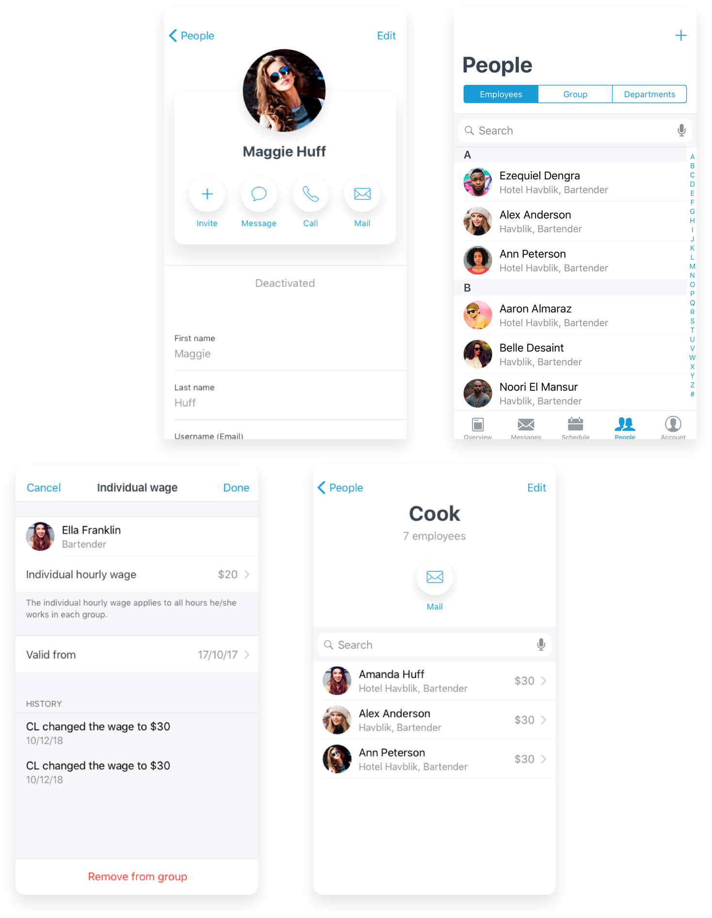
This section is mostly for the HR manager. Here’s where all your employees data lives. You can see everyone you work with as well as which location and position they work in. This is also where you can add and edit your positions and locations as well as customize hourly rates per employee.
06 Availability
Set your preferences
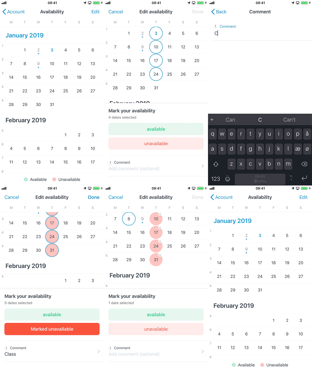
Another hot feature was the need to alert ones manager if you can work or not. We implemented a simple calendar selection tool where a user can also input a comment in order to let their managers know their reason for there availability, allowing managers to prioritize who can work or not.
06 People
Lots more features
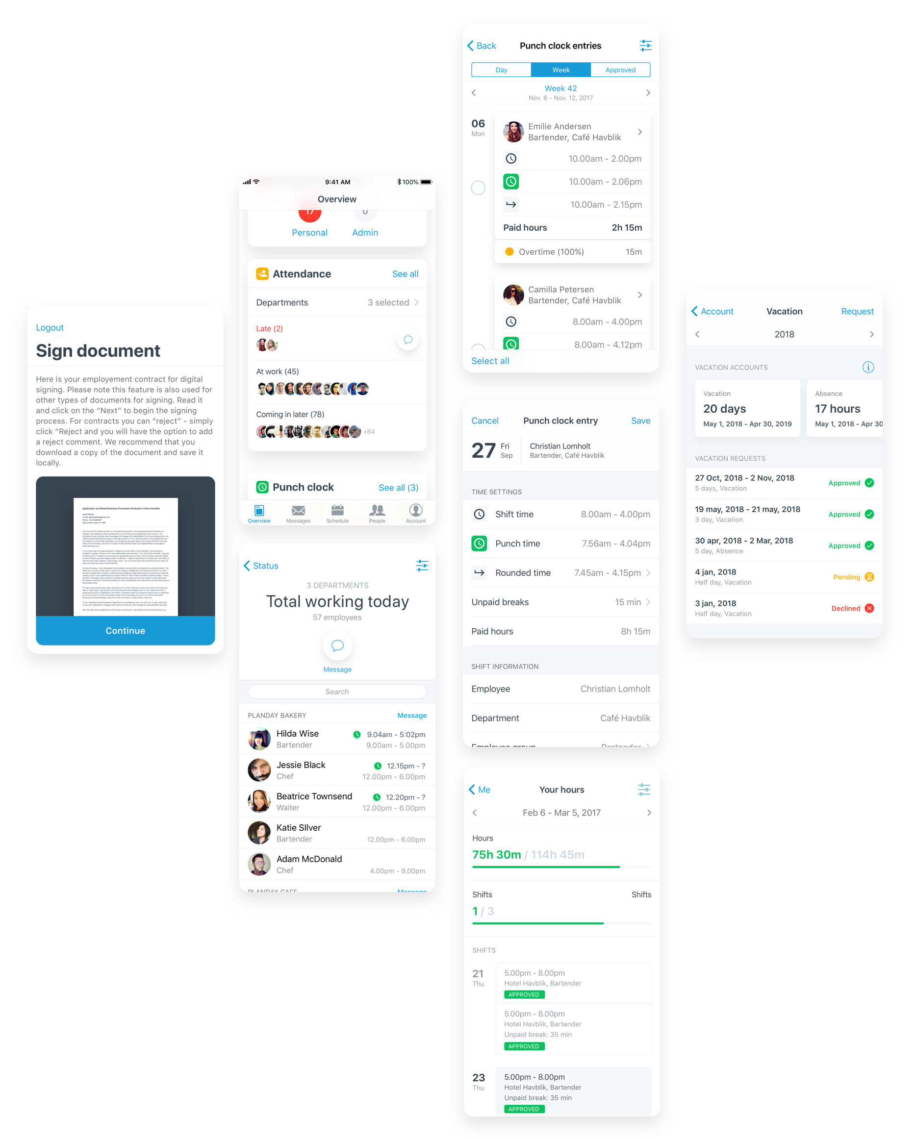
We had several other popular features outside the core functionality, including attendance, a manager only feature that allows you to see who is working today, if they had punched in, left, or were late. Another feature for managers was the ability to send new employees contracts that they can sign electronically, allowing them to get people up and running regardless of location. And for employees, noteworthy features included the ability to see your hours, how many you have worked and how many you were still scheduled for and the ability to request vacation.
08 Onboarding
Sign up
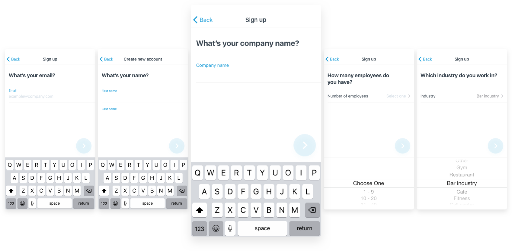
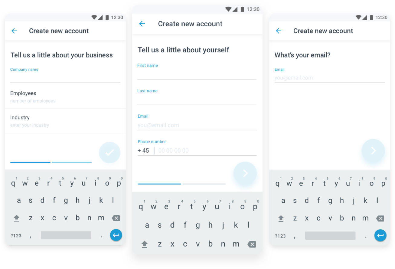
About a year ago I was tasked to improve our sign up flow as mobile was simply not taken seriously by our sales team due to its low rate of completion. We implemented A/B testing on a few options and ran three iterations of flows. Overall we increased completion rates on an average of 30%.
iOS
One of our iterations was the one by one screen flow. Each screen (with the exception of Name) had one field and a Next button, which led to about 6 steps. This worked very well on iOS with a jump of 34% in completion rates
Android
The experience
- Increased Android app ratings from 3.2 to 4.5
- Increased sign up completion by 30%
- UI redesign of both platforms
