An intuitive interface for discovering the Open API, as well as setting up, customizing, and taking full advantage of the powerful tools in our integrations.
Planday API and integrations
UX and Visual Design, 2019


Role
Year
2018
Skills
- User Research
- Visual Design
About
Six months ago, the Planday dev team released their first version of the Open API. Simultaneously our sales and project managers had been hard at work partnering with HR, payroll, and dining companies in order to make Planday a more robust and powerful experience. Shortly after the release a team for the entire platform was created, including yours truly. As our API became public and our integrations became more customizable we needed a better understanding of how our customers used their apps and a more intuitive way to navigate such technical information.
API
Create apps with our Open API
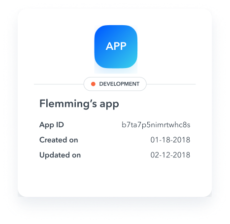
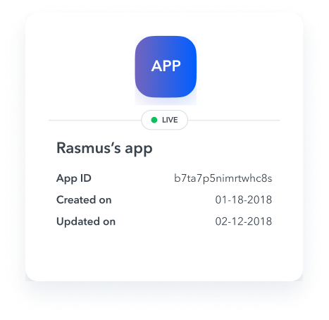
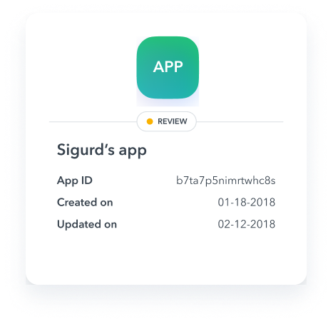
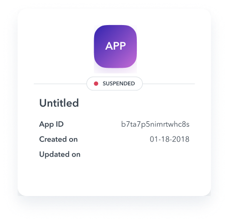
Working with the content writer, a new design pattern for an onboarding page was created to help users understand how to leverage our API, create and connect apps, as well as where they can delve in to play around for themselves. This screen defaults to an overview of your apps once you have more than one created, allowing you to edit, copy tokens, or revoke access. An app detail page allows you to edit permissions, and change the app’s name.
Import
As our platform grew, so did our customers. we realized very quickly that they needed more control and customization across their system. I was tasked with two major features, importing users and syncing payroll across systems,
User import
Our partnership with Xero was a huge win for our growing customers in the UK. Xero is a major up and coming player with a powerful platform that allowed almost unlimited customization. Our first version of import simply threw all the users from one system into the other, resulting in duplicates, missing fields, and errors. We needed a solution that was intuitive to use but powerful enough to allow mangers to match up any duplicate users created in either system, while keeping all information synced. It took about 4 rounds of usability tests over 3 weeks, as our knowledge of the systems also grew, but we managed to find a solution that decreased duplicates and errors exponentially. Completion rates of the set up also jumped from 40% with external support to 90% without support.
Payroll import
After several internal interview with our activation consultants, as well as with potential customers using various payroll systems, we created a simple payroll syncing feature. Every month, the payroll manager can simply choose which calendar in their external system they’d like to sync. Most businesses ran about two payrolls, one for their full time or regular employees and another for temporary and seasonal staff. Once synced, all shift types and hours were synced to your payroll system. No more importing excel files or even worse, manually entering data. A full breakdown by day was also included for schedule managers to double check times and breaks.
Marketing
Landing pages
Partnerships and integrations had become part of a larger more effective sales strategy for the company, so it was vital to create informative and illustrative landing pages.

The experience
To be honest, joining the platform team sounded unbelievably dull at first. Not only did I know nothing about API’s but I had no idea why the team needed any UX resources. I worked closely with a remote dev team in Poland and between our daily video stand ups and customer interviews, I quickly realized how invaluable this team was. My complete lack of knowledge may have also been an advantage as it allowed me to translate tech-speak into normal people words. It was great to visualize processes in a way people can understand as well as contribute to a growing part of the business.
- Decreased errors and duplicates for import
- 90% completion rate with reduced support tickets


